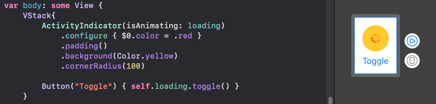
Indicadores personalizados
Aunque Apple ahora es compatible con el indicador de actividad nativo de SwiftUI 2.0, simplemente puede implementar sus propias animaciones. Todos estos son compatibles con SwiftUI 1.0. También está trabajando en widgets.
Arcos
struct Arcs: View {
    @Binding var isAnimating: Bool
    let count: UInt
    let width: CGFloat
    let spacing: CGFloat

    var body: some View {
        GeometryReader { geometry in
            ForEach(0..<Int(count)) { index in
                item(forIndex: index, in: geometry.size)
                    .rotationEffect(isAnimating ? .degrees(360) : .degrees(0))
                    .animation(
                        Animation.default
                            .speed(Double.random(in: 0.2...0.5))
                            .repeatCount(isAnimating ? .max : 1, autoreverses: false)
                    )
            }
        }
        .aspectRatio(contentMode: .fit)
    }

    private func item(forIndex index: Int, in geometrySize: CGSize) -> some View {
        Group { () -> Path in
            var p = Path()
            p.addArc(center: CGPoint(x: geometrySize.width/2, y: geometrySize.height/2),
                     radius: geometrySize.width/2 - width/2 - CGFloat(index) * (width + spacing),
                     startAngle: .degrees(0),
                     endAngle: .degrees(Double(Int.random(in: 120...300))),
                     clockwise: true)
            return p.strokedPath(.init(lineWidth: width))
        }
        .frame(width: geometrySize.width, height: geometrySize.height)
    }
}
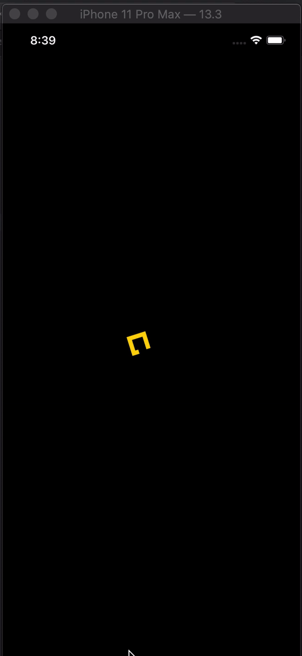
Demo de diferentes variaciones

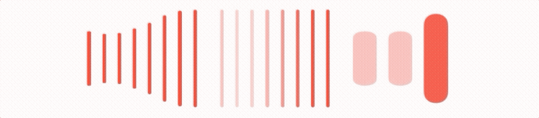
Barras
struct Bars: View {
    @Binding var isAnimating: Bool
    let count: UInt
    let spacing: CGFloat
    let cornerRadius: CGFloat
    let scaleRange: ClosedRange<Double>
    let opacityRange: ClosedRange<Double>

    var body: some View {
        GeometryReader { geometry in
            ForEach(0..<Int(count)) { index in
                item(forIndex: index, in: geometry.size)
            }
        }
        .aspectRatio(contentMode: .fit)
    }

    private var scale: CGFloat { CGFloat(isAnimating ? scaleRange.lowerBound : scaleRange.upperBound) }
    private var opacity: Double { isAnimating ? opacityRange.lowerBound : opacityRange.upperBound }

    private func size(count: UInt, geometry: CGSize) -> CGFloat {
        (geometry.width/CGFloat(count)) - (spacing-2)
    }

    private func item(forIndex index: Int, in geometrySize: CGSize) -> some View {
        RoundedRectangle(cornerRadius: cornerRadius,  style: .continuous)
            .frame(width: size(count: count, geometry: geometrySize), height: geometrySize.height)
            .scaleEffect(x: 1, y: scale, anchor: .center)
            .opacity(opacity)
            .animation(
                Animation
                    .default
                    .repeatCount(isAnimating ? .max : 1, autoreverses: true)
                    .delay(Double(index) / Double(count) / 2)
            )
            .offset(x: CGFloat(index) * (size(count: count, geometry: geometrySize) + spacing))
    }
}
Demo de diferentes variaciones
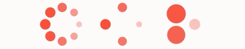
Intermitentes
struct Blinking: View {
    @Binding var isAnimating: Bool
    let count: UInt
    let size: CGFloat

    var body: some View {
        GeometryReader { geometry in
            ForEach(0..<Int(count)) { index in
                item(forIndex: index, in: geometry.size)
                    .frame(width: geometry.size.width, height: geometry.size.height)

            }
        }
        .aspectRatio(contentMode: .fit)
    }

    private func item(forIndex index: Int, in geometrySize: CGSize) -> some View {
        let angle = 2 * CGFloat.pi / CGFloat(count) * CGFloat(index)
        let x = (geometrySize.width/2 - size/2) * cos(angle)
        let y = (geometrySize.height/2 - size/2) * sin(angle)
        return Circle()
            .frame(width: size, height: size)
            .scaleEffect(isAnimating ? 0.5 : 1)
            .opacity(isAnimating ? 0.25 : 1)
            .animation(
                Animation
                    .default
                    .repeatCount(isAnimating ? .max : 1, autoreverses: true)
                    .delay(Double(index) / Double(count) / 2)
            )
            .offset(x: x, y: y)
    }
}
Demo de diferentes variaciones
En aras de evitar paredes de código , puede encontrar indicadores más elegantes en este repositorio alojado en git .
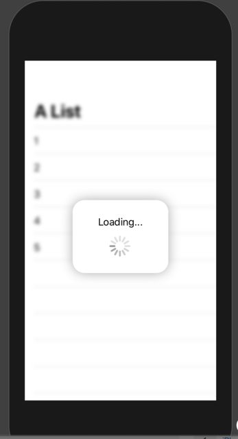
Tenga en cuenta que todas estas animaciones tienen Bindingque DEBE alternar para ejecutarse.